
Many people are unaware of the Nest and Cross features inside TIBCO Spotfire so this tip is aimed at explaining what they are and how they can be used.
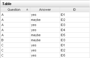
Let's assume we have the following survey data loaded in TIBCO Spotfire Professional:
We may want to plot the total number of responses for each answer category (yes, maybe, no) for each question (A,B,C). Using the default settings on a Bar Chart, we can configure it to show this info, as shown below:

This will interact with filtering, so if someone decides to filter out the Answer 'No' using the Filter Panel, the result will look like the following:

You can clearly see 'No' is removed altogether from the bar chart. What if you wanted to still include the 'No' category to show its there, but filtered out? If you wanted to do this, you would you would click on the 'Settings' button inside the X-axis Properties Dialog.
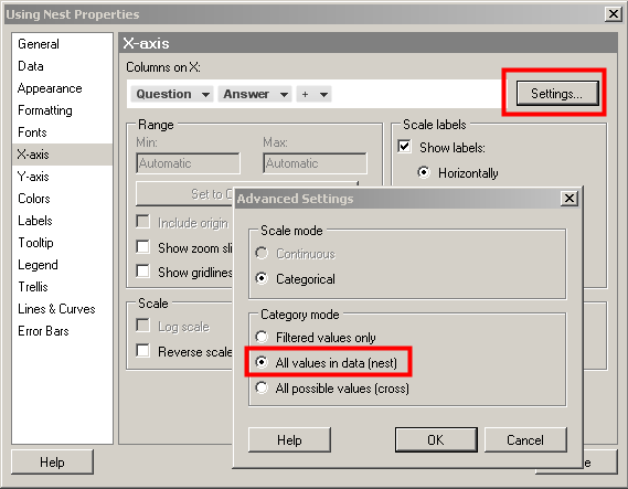
If you change the category mode to 'Nest', then this will show all values in the data set, regardless of whether the filter is applied. This is shown in the Bar Chart below where the 'No' category in the Answer column is still filtered out, but it shows up on the x-axis.
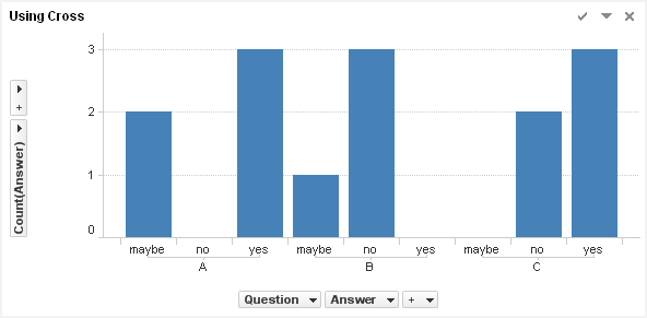
Lastly, if you want to show all possible values, you would use the Cross setting. In this scenario, lets say there is no filtering applied ,and you want to show all possible values (yes, no, maybe), even if there are no responses with that value.
This is shown in the Bar Chart below. There were no responses for no in Question A, yes in Question B, and maybe in Question C, but the values are shown in the Bar Chart as a possible value asked during the survey
.
Below are screen shots showing all the three different settings in action when there is no filtering and then when the 'No' values are filtered out.

No filter

The 'No' values are filtered out of the 'Answer' Column